
Graphic design
portfolio
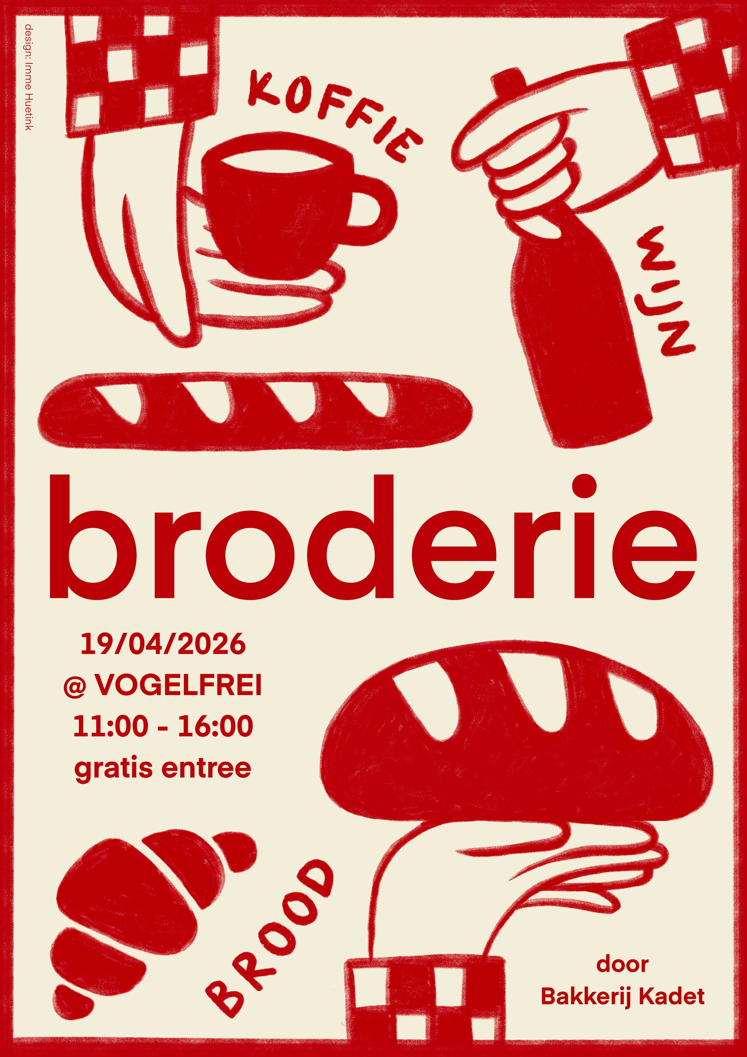
Poster
for Broderie Utrecht
2026
A poster design for Broderie Utrecht, a market for artisan bread wine and coffee.
Clublogo design
for VV Ondiep Vooruit
2025
The brand new football club VV Ondiep Vooruit needed a logo that would represent the neighborhood it’s located in.
The tuning fork shape shows the typical pattern of the main streets in Ondiep.
The waves represent de Vecht, the river to which Ondiep owes its name.
As the club has 3 core values, the waves in the logo also come in three.

Poster
for Nieuwe Oost & ZININ
2024
A poster design for interior stores Nieuwe Oost and ZININ to announce their participation to GLUE Utrecht and their own sub event. They requested a cheerful summer-y design with flowers, drinks and a train track (which runs in between their stores).

Logo design
for Bakkerij Kadet
2025
Utrecht’s newest sourdough bakery Kadet requested a colorful logo design with a duck.

Postcard
for Vechtclub
2024
A ‘congratulations’ themed postcard with a simple but humorous design.

Dutch Aeropress Championship poster
for Keen Coffee
2024
I was honored to design the 2024 Dutch Aeropress Championship poster. I used the components of the aeropress to create an interesting and fun composition. Details like the rough pencil line creating a frame and the textured edges of the elements make the design a refined whole. I designed the title font especially for this poster.

‘Mama Qucha’
beer label
for Keen Coffee and De Kromme Haring
2024
On the occasion of the Dutch Aeropress Championship, Keen Coffee joined forces with beer brewery De Kromme Haring to create Mama Qucha; a hoppy saison beer infused with the 2024 DAC coffee.
Mama Qucha is the ancient Incan goddess of the sea and fishes. So for this beer label design I created a crown for this goddess using the same aeropress elements used in the poster design.

For Roodnoot’s latest EP album ‘When All Is Said And Done’, they wanted to have a cover made which reflected the making of their music. Since their songs are built from many recordings which have been cut and distorted, we decided a graphic collage would make a beautiful representation.
With analog pictures of mountains as a starting point, I experimented with cutting and reassembling those pictures together with other materials. I saw a similarity in the behavior of crumpled paper and the mountainous landscapes. The combination of those two elements in a newly crafted landscape together with a digital distortion in the middle, makes an interesting image. Like Roodnoot’s music, is shows how all these different elements can make a new whole.
EP artwork
for Roodnoot
2023

As part of their new album, the band Jason Waterfalls assigned me to create an artwork for one of its songs, called “The Great Masquerade”.
Inspired by the song’s theme - gradually putting on a figurative mask, and forgetting who you really are - I wanted to use a similar development of ‘real’ turning into ‘fake’ in the making proces. I translated this in the contrast of analogue and digital design. After simply cutting and reassembling a face on an old magazine cover, I used these try-outs as an inspiration while further experimenting digitally.
The end result is a mysterious image of a woman with a pixelated version of herself as a mask. Her true expression is hidden behind the mask, making you wonder what her eyes are trying to say. The mask is built up by increasingly growing pixels, making the image gradually more simple; a shallow, fake version of herself.
Song artwork
for Jason Waterfalls
2022
Logo design
2021
Exploring the integration of my initials (IH) in a logo design through animation.